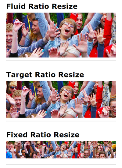
When designing pages and creating responsive backgrounds, there are three options of how the background can behave when resized to a mobile device's size.
1. Fixed Ratio Resize - The aspect ratio is maintained, regardless of how skinny the window gets.
Usage: When automation is more important than artistic control.
Example:
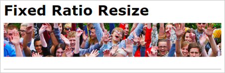
In our case, that would mean to get the background image in a fixed position somewhere on top of the Landing Page. This is how it would look like:

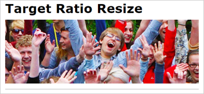
2. Target Ratio Resize - Image resizes up to where its dimensions constrain it to scale to a target aspect ratio. In this technique, only the banner image width shrinks, to begin with, until it hits the padding-top/aspect ratio threshold, and, then, the height is affected too. Because of this non-linear scale-down, it can result in a disproportionate text-to-image relationship in responsive layouts. This is no way as near as bad as the first method, but it could still cause visual inconsistencies.
Example:
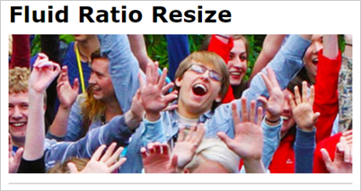
3. Fluid Ratio Resize - This is our case. The image scales, according to the screen size and content amount. Background image fills the screen and adjusts the image to fill the screen of any size, zooming in or out on the image. Depending on how much content is added to the screen and makes cuts on the sides, focusing on the middle part of the image.
Example:
Here is a video that explains different examples in more detail and gives you ideas on how to overcome the difficulties you encounter: