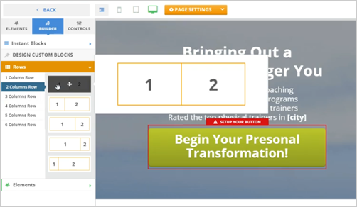
It is important to understand the concepts that are being used when working in rows. You can use up to six columns with multiple rows. You also have the ability to structure your column rows into equal or offset build.

Rows are used to help create a dynamic flow for your web page. Rows and Columns break up how the page is viewed depending on the device. These controls help stack content on small screen devices and help lay out compelling content. A row is a horizontal count of what items will be grouped, while columns are a vertical delineation of how each row will be divided.

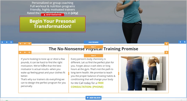
To control your rows, hover your mouse on the element. In this example, there are three columns inside of its rows.