
One of the Seven Rules of Creating Ad Designs that Convert is to “Never Make Text Hard To Read.” You should be thoughtful about choosing an image that allows the text to stand out and be visible.
The simplest solution is to select a cover with a background that will contrast with the business' logo. If you use a cover with a gray background and the logo is also gray, the logo will not be visible.
Here are a few tricks that you can do to fix your cover if the logo is the same color as the background:
Option 1.
The quickest way to fix this cover is to change your existing template to another one that does not have a gray background. You can do this by clicking the Back button until you reach the section where you select your template again.

Option 2.
If you want to use the current template you have selected, you can adjust the Brightness and Opacity of your Background Image so the logo will be visible. You would do this by clicking on the background image, and once the image settings widget appears, adjust your image’s Opacity and Brightness.
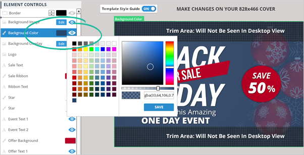
Option 3.
You can also change the cover’s background color so that it will contrast the color of the logo. You can do this by clicking the Background Color on your Element Controls section then selecting the color of your choice.
Related Articles:
How To Use Social Covers To Redirect People To A Website
Social Covers Powerpoint Presentation
Social Covers Advanced Training
How to Use Dropbox to Store Social Cover Images for Email Templates
Choosing the Right Cover Design and Size
How to Use Background Remover