The Layout Options section of the Feedback Page is the actual branding setup, design options, and sidebar options for all of the feedback pages for this company.
The Layout Options is divided into three parts:
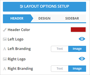
Editing the Header
The Header section lets you edit the company’s branding information. In this section, you can change the color of the heading and either use a text or image for their branding.
To change the color of the header, click the Header Color element.
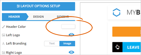
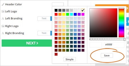
Select a color and click Save.
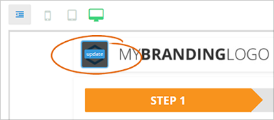
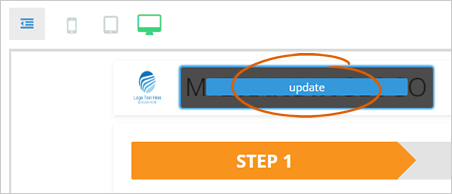
If you want to change the default header logo, hover your mouse over the logo and click the Update button.
This process applies to both left and right logo elements.
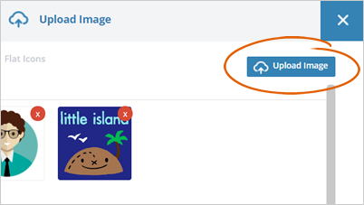
Click the Upload Image button.
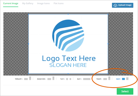
Select an aspect ratio and click Select.
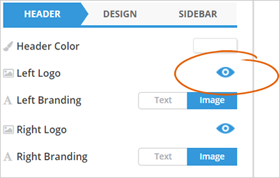
To hide a logo from the header, click the eyeball icon.
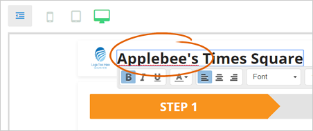
If you want to change the header’s left or right branding text, click the text on the header start typing the new header text.
If in case you have chosen to use an image for your branding, hover your mouse over the image and click the Update button.
Once you are done setting up the layout and design of the header, click Next.
Designing the Feedback Page
The Design section gives you all the tools that you need to fully customize your feedback page. This includes the ability to choose and set a theme, customize the background color, and set up the color and style of your page’s buttons and text.
Start by selecting the right theme that best fits the company.

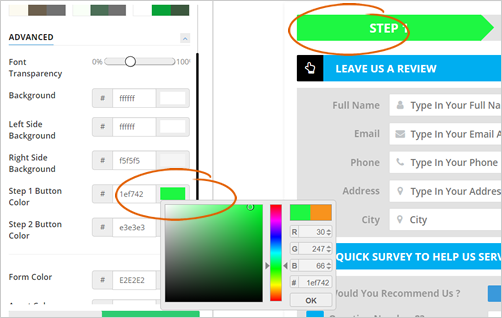
In the Advanced section, you can set up the color of your background and step button color.
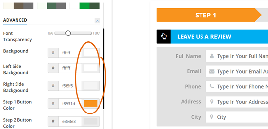
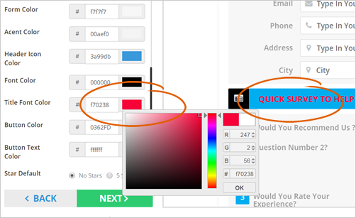
To change the default color of the form's elements, click the color tile of the element that you want to set up.
In this example, we are changing the Step 1 Button Color to green. Once you picked a color, which in this case, green, click the OK button.
The next set of elements lets you customize how your form will look like. You can change the default form’s color, the font’s color, and the button’s color.
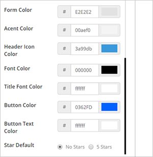
You can start changing the color of the said elements on the form by clicking the color time of the element.
In this example, we are changing the Title Font Color to red. Once you picked a color, which in this case, red, click the OK button.
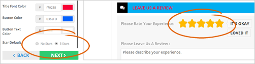
The Star Default element lets you set the prefilled stars of the Rate field on the survey form.
If you select the 5 Star option, it will automatically fill this field with 5 stars. Once you are done, click Next.
Setting Up the Sidebar
This will be the last section of the Layout Options. This set of elements let you customize the appearance of the Feedback Page’s sidebar and how reviews are displayed.
In the Sidebar section, select the Review Layout style that you think is best to use.
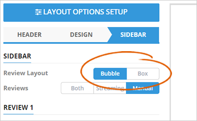
Select how review are displayed. This can be streamed, manually inputted, or combination of both.
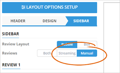
If you selected the manual option for the review, you will be asked about the review’s details.
This details includes the reviewer name, rating, the site where the review was left, and the actual review itself.
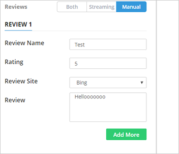
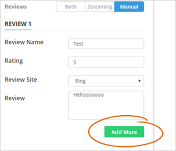
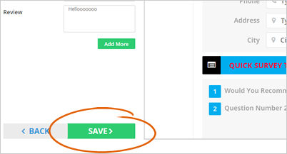
To add more reviews, click the Add More button.
For better results, click the Update Preview button to view the actual feedback page that you have just set up.
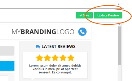
Once you are done setting up the feedback page layout, click Save.
Related Articles:
How to Hide the Videos on the Feedback Page
Feedback Page: Video Update
New Feedback Page: Why Aren't the Emails Going to the Correct Feedback Page
The Smart App Strategy for New Feedback Pages
How to Set up Feedback Pages
Feedback Pages Dashboard