Funnel Pages has amazing functionality that will make your life easy. One of these features is the ability to test your design to make sure it is responsive and will look good on any device, right from the Page Builder.
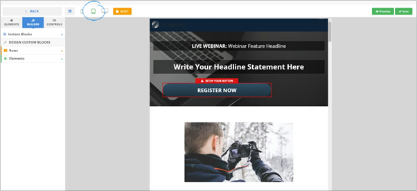
Testing from a Mobile Perspective
Click the Mobile icon to test your design on a mobile device. In this view, you can see how your page will look on a small handheld device, be sure to look for any text that is out of place or images that are not looking how you had intended.
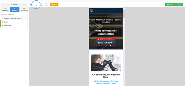
Testing from a Tablet Perspective
Click the Tablet icon to test your design on a tablet device.
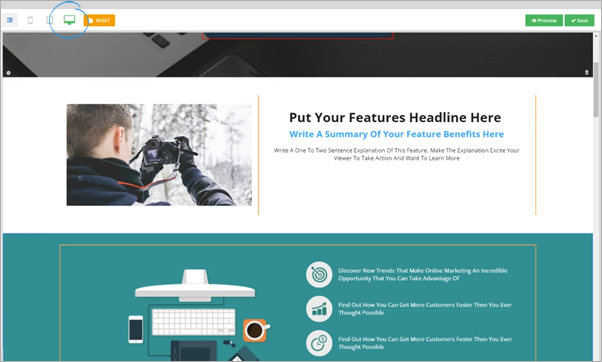
Testing from a Full-Size Monitor Perspective
Click the Monitor icon to test your design on a full-size monitor.