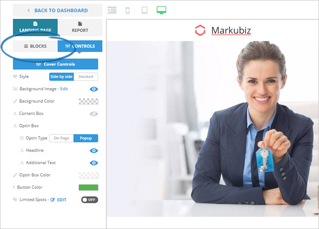
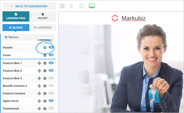
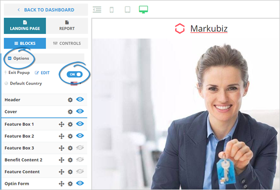
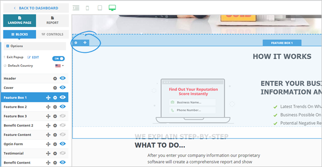
Landing Pages are separated into two important parts - blocks and controls. Once you click on the blocks, it will operate each of the blocks on the landing page.
To jump straight into the editing mode for a particular block that you need to adjust, click the cogwheel icon, and it will open the control for that block.
To return to the list of blocks, click the Blocks tab.
To update each of the blocks, click on the cogwheel icon, and it will open the detailed editing mode for each of the blocks.
To jump on a topic, click on the quick links below:
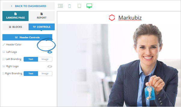
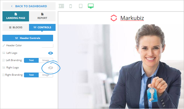
Header Controls
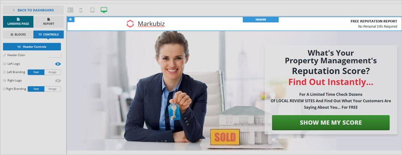
Here are the different header controls that you can use:


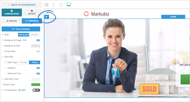
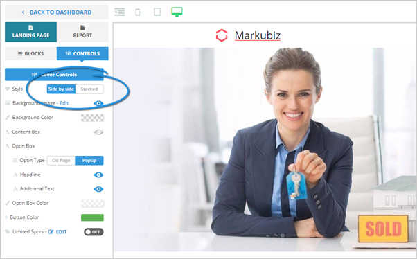
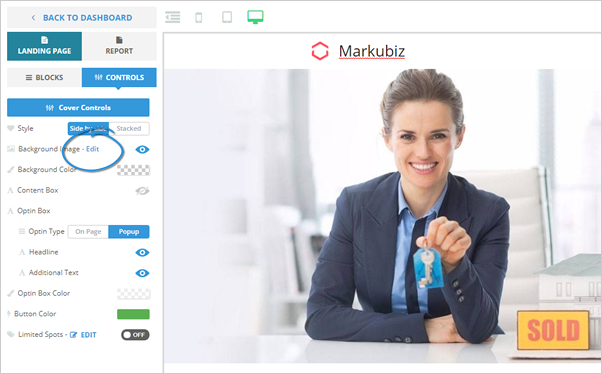
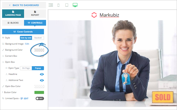
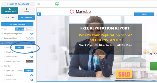
Cover Controls
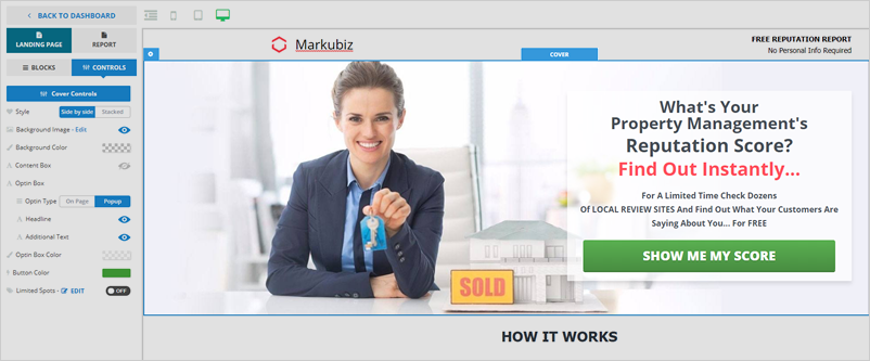
Here are the different cover controls that you can use:
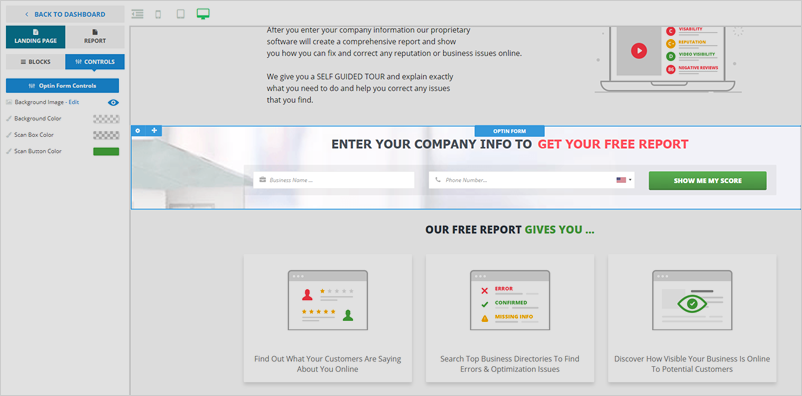
Optin Controls
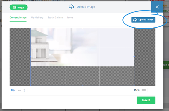
To change the background image, click Edit.
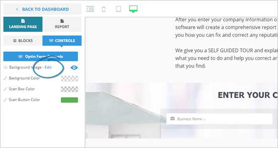
You can either either use the existing images in the gallery or click the Upload Image button to upload your image.
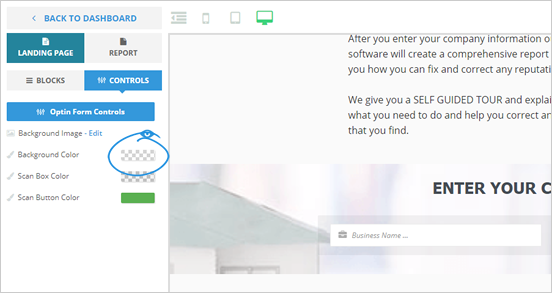
To change the Background Color, click on the color tile.
The Scan box color can be adjusted as well. Click on the color selection and then either select the color of your choice or make the opacity greater, so you can see the change in your optin box's shading. Once you are done, click Save.

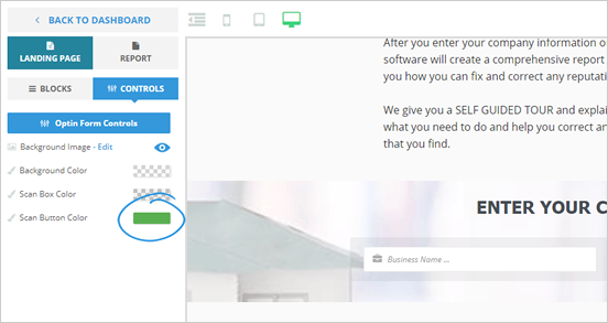
If you want to adjust the Scan Button Color, click the color tile and select the color of your choice. Click Save if you are done.
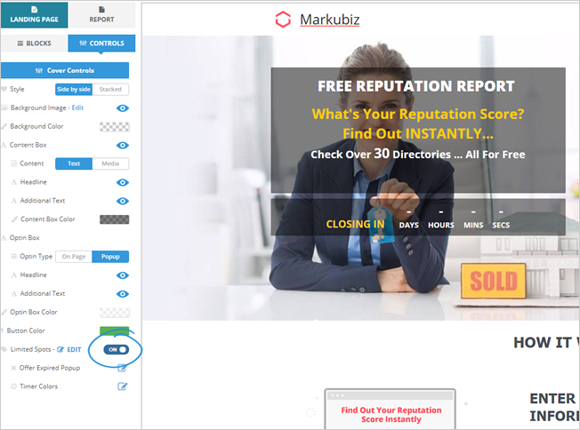
Exit Pop-up Controls
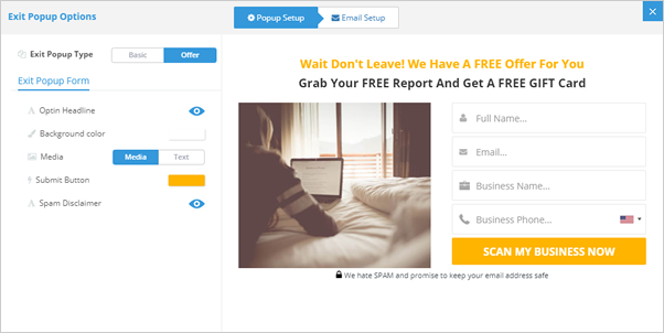
There are two exit popup types - Basic Exit Popup and Offer Popup. Basic Exit Pop-up only asks for basic information, like a business's name and phone number. On the other hand, Offer Popup asks for the user's name and email and their company's information. You also can add a video in your Offer Popup, which makes this popup very customizable.
To enable your exit popup, expand the Options section and toggle Exit Popup to ON.
Select which popup type you want to use.
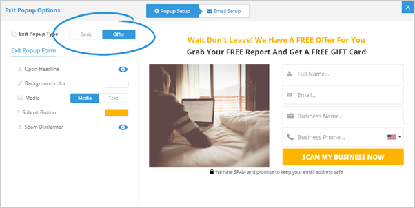
Use the different elements to customize your popup.
Learn how you can add a video in your exit popup here.
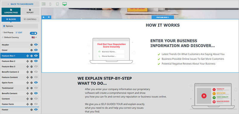
Other Blocks and Controls
The remaining blocks, such as your Feature Box, Testimonial, Benefit Content, Content, and Footer, can also be customized using the different elements within it.
Like the other blocks discussed above, you can customize their background color, change the background image, edit the text contents, customize the button’s color, and other elements that will help you custom brand your different blocks.
Drag and drop controls – use this to update the page and move things around on the page. Grab the box of your choice and place it on the position of your choice.
Note: All blocks can be arranged except for the Header, Cover, and Footer blocks.
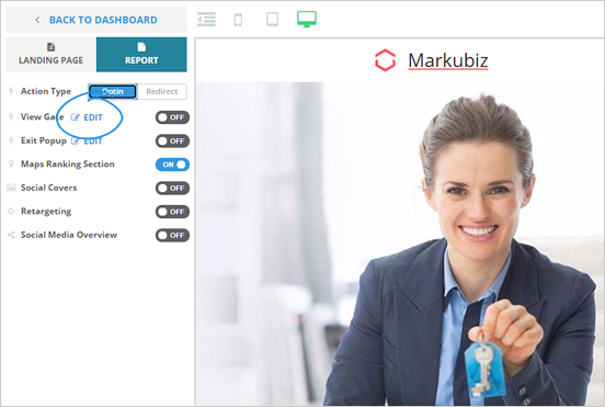
Report controls – click report and action type. Adjust your Optin. To update your optin form, select the headline, add optin fields (add a checkmark if field is mandatory), and add mobile phone. Save your page once you are done.
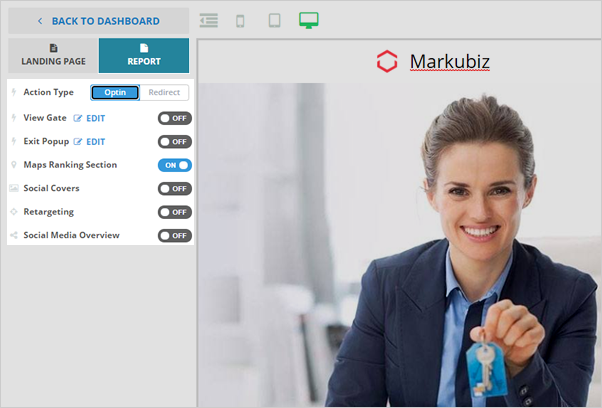
View gate controls – click Edit and choose to see the optin headline or remove it altogether.